• Skip to primary navigation
  • Skip to main content
  • Skip to primary sidebar

Remember Lenny

Writing online

  • Portfolio
  • Email
  • Twitter
  • LinkedIn
  • Github
You are here: Home / Archives for rememberlenny

rememberlenny

How to succeed at being a graffiti artist

February 24, 2021 by rememberlenny

Building your product, getting up, be recognized and exit

Here is a recent presentation I gave at an unconference event. I don’t paint publicly today, but it’s a fascinating space so I presented on “how to succeed at being a graffiti artist”.

Thank you all for joining this session today! I’m going to be presenting on a topic slightly different than the originally proposed title “How to paint graffiti and everything you didn’t know about street art.” A better title would be how to succeed at being a graffiti artist, y-combinator style. This is going to be a very deep dive into the career of a hypothetical graffiti artist, of which I largely don’t think exist. As a humorous way of synthesizing all the great sessions we have had, I’m going to share the parallels between graffiti artists’ careers and growing a startup.

As a graffiti artist, you need to design your pieces and build your product, then you need to get sales, market your product to the masses, hire to expand your crew, and finally consider an exit strategy. Following this advice could lead you to glory and riches, but much more likely is you’ll end up in jail and jaded about the world.

A bit of background here – I became passionate about street art growing up in San Francisco, at the age of 8 – where I was regularly seeing abandoned shop faces and parking lots with big colorful murals. My brother at the time was himself painting graffiti and had a cache of spray cans that I remember seeing. As I got older, I found a job at a retail art store, and from there began my juvenile spray painting. Through high school, I got into a bit of trouble and was expelled – which did not deter me from continuing my nighttime pursuits of scaling buildings. Eventually, after college, I moved to China, where I was part of a local graffiti crew, and ironically also where I met my cofounder (not related to the graffiti). Eventually, I stopped painting publicly, but ended up making software related projects to help graffiti artists evade the police, and finally started indexing all the street art online through Instagram and Flickr. This project interestingly received some grants/funding and became indirectly my foray to getting funding in startups.

So starting off! 

First, let’s start with PRODUCT. All graffiti artists have a product. Of course, you have tools and resources you use, but the product is what you create. So for a graffiti artist, letter forms and characters are everything. Graffiti has changed a lot over the years – for one, it started in the north east, some say Philadelphia, others say New York – but essentially, it started in a concentrated area in the late 70s. If you want, you can watch a fascinating documentary that captures this period in a movie called Style Wars, which I believe is on YouTube. It very much has the vibes of Pirates of Silicon valley, which is a brilliant movie about Steve Jobs and Bill Gates – but street art related. 

As you can imagine, the spray can is to street art, as silicon is to tech companies. Today a lot of street art and graffiti use all kinds of materials from dynamite to glue, but at the essence of it all is the essential brand or name that is being painted.

So – first you need to pick your name.

The name of your piece is going to be important because you are likely going to be working on this for quite a while. You likely will paint your name over and over again tens of thousands of times, so picking this carefully in the beginning is important.

Important aspects here are around the letters you pick, their combination and the deeper meaning of the word for you (founder-market fit?). The letters you pick are important because you can have uniquely expressive lowercase and uppercase letters. Sometimes the letter combinations are important also, because they will allow your entire word to either take up more space or be easier to read and write. For example, a lowercase g and an uppercase G are totally different shapes, so there’s a lot you can do with it. Comparing this to a P/p for example, which doesn’t look that different in both forms. You also need to think about how distinguishable a letter is with various styles. For example, a U and V can look similar, so you need to be conscious how the letters will need to be drawn to make sure it is legible.

Unlike picking a good start up company name, you don’t need to worry about it being easy to pronounce or getting a good dot com address. In fact, it’s probably better if it’s harder to pronounce, so the police records on you result in mistaken inputs, and less attention from the wrong people.

It’s worth noting, like many startup names, there is likely someone who already painted your word before you. It’s going to be up to you whether you can out execute and differentiate them when doubling down on yours.

Once you are clear on your name, then you need to understand your tools. Like building your startup, where there are tons of frameworks and languages you can use, you can decide to go commercial or bespoke. 

As I mentioned, the tooling here is endless, but the goal is to make a mark that lasts. From the smallest point of impact with the longest lasting mark, many graffiti artists will have some form of a chisel. This lets you carve into plastic, mirrors, windows or metal. An amateur will carry around a key or sharp piece of metal, but the pros will have diamond tipped drill bits. You can get these at your local hardware store, and nothing will be out of your reach. With these drill bits, you will have high expressivity, but carry around a very small object. 

Next is your pens. Street artists love drips, so the best pens are the ones that let you control how much ink is released when you draw. These can be literal mops, that let you squeeze out ink on a surface, or they can be paint based with felt tips. Whichever you use, an intentional graffiti artist is going to want to last even if it’s painted over. In this case, a good mixture of ink will seep through multiple layers of paint and leave a lasting impression.

The most common tool for a graffiti artist is going to be the spray can. Surprisingly, there are a lot of different kinds of spray paint, and even more so, there are countless types of spray paint tips. From the paint side, you can find a series of commercially available kinds, such as Rustoleum, which is aerosol oil paint, Krylon – which is a common acrylic, or even lighter materials that are meant for the likes of floral coloring. Technically, at some stores, you can also find aerosol food sprays, but that’s not going to fit the “permanent” bill. 

If you go to a true art store, you get an entire different category of spray paints which are going to specialize in details that matter for an on the run artist. For one, you can get a much wider array of colors, which aren’t going to be available on the mass market. Everything from avocado green to skylark blue. These wider colors come in a variety of materials , such as oil and acrylic also, but most importantly is that they can dry quickly due to a higher pressure, which gives you the ability to cover more surface quickly. Another key important detail is to decide on oil or acrylic, but not to mix them. Oil can paint on anything, but will break up an acrylic spray if painted over while wet.

Next are the spray caps. This is the heart and soul of a graffiti artists mode of expression. There are two main categories of a spray cap – female and male tips. Most consumer spray paint today uses a female tip insert, as the most common street artists tips are male based. As a result, the markets have adapted and started creating female tip adapters, but they often leak paint. 

The spray caps will vary in a few important ways. First, the nozzle of a spray cap will control the release of paint from the spray can. What this means is that the surface of the spray can be controlled based on the size of the nozzle hole and the surface of a spray cap exit. A larger surface on a spray cap will let you have a larger cone of paint, which can distribute more paint quickly. Also this will allow you to have highly controlled effects when moving the spray can quickly closer and farther away from the wall. I’ll go into this shortly, but a talented artist will master their “can control”. A negative on the larger nozzles is that it will cause the paint to drip when not used carefully. You don’t want to be the artist with tons of drips, since it looks tacky and can take time to fix up. To compliment large nozzle spray caps are smaller nozzle caps. These are important for details, when you are trying to make fine lines. Also there are caps that control the speed of the spray, so you can create intentional airy looks, such as for certain visual effects. Finally, there are certain caps that will spray their nozzle cone unevenly, such that the edge of the cone nozzle will collect paint faster than the center – which allows you to create flares.

An important point to consider is that you need to take good care of your tips once you use them. Since the spray paint will dry quickly, it’s good to give you caps a “cleaning” spray by turning your caps upside down and spraying out air, to make sure the nozzles don’t clog and paint doesn’t dry by affecting the cone output. For this reason, it’s good to have backup nozzles.

Personally, my favorite tip is the NY Fat. This is a long time favorite and was originally inspired by the spray nozzles found on cleaning materials, such as spray-on bleach. As you can imagine, the original spray paint cans used spray tips from other household aerosol products, and did not have the wide range of selection. Another trick that used to be used for getting interesting color effects was to intentionally clog your tips with one color, and then use that tip on a new color can to get the after spray of the first color. This kind of mixing and technique is advanced.

Next you need to pick your style.

While there are various kinds of graffiti, heres the high level taxonomy of your “graffiti-stack”: at the lowest end, you are going to see tags. On the surface, tags are going to vary in quality and style, but a talented artist will be able to turn the simple spray paint spray cone and create true art. As mentioned earlier, good can control will let you intentionally flare the spray can and create effects that are only possible with a tag. Generally, you don’t want to go too crazy with flares because that will just look bad. When a script kiddy of a vandal gets a spray can, it’s not too different from someone with a javascript library who doesn’t know how to use it correctly. It can look like gang graffiti done by elementary school kids, or worse, just scribbles.

Next are throw ups. This is the meat and potatoes of the graffiti world. It’s often a two color letter form that has a few core elements: a fill, and an outline. Creative artists will play tricks with letters and letter combinations here. The tip of an I for example can be much more than just a dot. You can make it into a crown, a face, or as a startup in growth mode – a dollar sign. Certain letter combinations are also fun to play with – and oppositely others can be harder to read. 

The key motion for a throw up is that it should be possible to put up with two cans of paint in a few minutes. You first take your fill color and spray out your outline. Then in reverse order from the direction you painted your outline, you start filling the entire outline. Then you take your second color and go through one time to make a clean outline. One common effect when doing the outline is to add more weight on one side of your outline to create a shadow effect, which gives a popping out look to your letters. Depending on the surface you are painting on and the color contrast, it’s good practice to then do one more final outline around the entire piece to create some intentional color contrast against the background. It’s not uncommon to add final accents, like bubbles, stars or a common “big” Chinese character.

When it comes to picking the two colors, you want to maximize the contrast between your pieces. Good default colors are blue and white, silver and black, or something with similar contrast. If you get too creative with a red and orange, you risk the chance that the outline and fill aren’t distinct enough to read, and just waste paint.

Notably, when doing a throw up, it’s either common to see a quick style that is done alone, or two different people throw up next to each other. As you can imagine, depending on the location you are painting, either you want to have a look out and a switch off between the person painting and person watching – or you want to paint with someone else to simply keep company. If you want to extrapolate to starting a startup, you could say that this person is your cofounder, and while you talk to customers (aka watch for police), your cofounder builds – or vice versa.

This throw up style can also be done at scale, with groups of people. In this case, if you wanted to cover an entire train car in three minutes, you would need 8-10 people who simultaneously know which letters or parts they are covering, and during the fill motion, use one can per hand to do the fill quickly. After the fill in is done, again you coordinate to choose who covers which letters, and then quickly if needed a final clean up can be done.

After throw ups, the more common style is a mural also known as a wild style. This is the most common quality graffiti you will see and varies significantly in quality. Unlike the throw up, these will involve countless colors, attention to detail and many times characters to compliment the letter style. Also when it comes to larger murals, it’s more common to see groups of artists paint together. These groups are often not individuals in isolation coming together, but generally are part of a crew. Again, extrapolating a bit, this could be like your startup. This means they are artists who identify with each other and either paint one another’s names on their own pieces for recognition, or have an abbreviated tag that everyone in their crew will paint. The abbreviation is normally a three letter combination, such as MSK or SLC, which may have an original meeting, but they will also use the abbreviations in other sentences that use the same starting letters.

Beyond the traditional tag, throw up and mural, today you have many artists who define themselves either with other materials or characters. Some of the interesting ones being stencils, like the well known Banksy, but others being explosives like Portuguese artist Vhils. Beyond that, bucket paint is also used for very large pieces, which are done with paint rollers and are known as roll outs.

A note about the legibility of the three core types of pieces. When you paint your name in any style, you want to make sure it is easy to read, at least by other graffiti artists. To do this, you will need to make sure the letters you paint have strong power lines. This means the E looks like an E and not an F. The core parts of the letter should be distinct, and to do that you make the core shape of the letter clear or use good colors to contrast the visuals.

Pin by Alfredo De Santos Ruiz on graffiti letters | Graffiti lettering,  Graffiti wildstyle, Graffiti writing

One note here on the product – you are going to try and innovate on your letter form, but there is a limited number of letters and ways to draw them legibly, so feel free to take inspiration and copy others. Like a startup pricing model, you don’t need to reinvent the wheel. Find some letters you like and just copy them for your own word. That being said, you should be distinct enough that people don’t look at your letters and immediately think that you copied them from a more well known artist. This can happen when another artist has defined a certain style, such as 3d letters or a certain type of block letter form.

Okay – that was a lot on the product. Next I’m going to talk about SALES – or as a graffiti artist would say, “getting up”. Getting up is everything, so you can also think of it as capturing market share. In any city, there is a limited number of spots that you can safely paint at that are available at any time. Being able to differentiate on when you get up will define how you are recognized.

10 Graffiti Terms and Their Meaning | Widewalls

Of course, when you pick locations there are the basic places like bridges and tunnels, or abandoned buildings which are going to lend for longer painting times. Often these places will also have your pieces last longer, but if a city has a limited number of painting spots, you can also expect your pieces to be painted over by another artist at some point. These can be found in any city and the right eye will know where to look. 

Next you are going to have higher profile places. These are going to be higher risk, but with the reward of lasting longer. Higher profile here will mean that more eyeballs will see what you paint. This can mean painting near a high traffic area, like a freeway, or getting up on a roof that has large visibility across a larger area.

When it comes to painting in high profile areas that aren’t hard to reach, you can also expect your piece to be painted over quickly by the “buff”-ers (not to be mistaken with bandwidth), so you’ll want to make sure to get a picture in case it’s painted over even by the morning time. Most cities will have a hotline that citizens can call, and a budget to pay for painting over graffiti. Based on this budget, a number of contract based graffiti removing services will be rewarded for the pieces they paint over. This is actually a larger business than most people realize and if I wasn’t such pro-graffiti, would likely be something I’d build a better version on.

Finally in regards to location, you want to also consider opportunities to get moving landmarks. The most notable type is a train car. You can imagine getting a full train with your tag moving around the city, but in reality, the moment a train car is painted, they are taken out of service and cleaned. In 1980s New York, the subway culture surrounding trains was one where people painted the trains in the train yards before they would go out, then watch them in circulation.

Another great moving landmark are box trucks. These are large white trucks with clean surfaces 

Today the best kinds of trains to paint are freight trains. Freight trains are going to travel around the country and will often not get painted over if you follow one keynote: don’t paint over the serial number. Freight cars each have key identification blocks which contain the train information and car. As you paint freight trains, either in their train yards or even while they are moving slowly, you want to avoid painting over the ID information, so the train cars have no reason to be serviced.

One last point when it comes to locations – there are rules around places that you definitely don’t want to paint. The key places are government buildings, places of worship, and peoples houses. For obvious reasons in each, you just don’t do that.

Going back to marketshare, since there are a limited number of good spots in any city, you need to watch out for competition. In graffiti, every time someone is painted over, it’s loaded with meaning. It’s almost always intentional. I like to think of this as the equivalent of buying ads against the search terms of your competitors. The main difference though is that with a startup, it can feel like getting punched in the face, but with graffiti, your competition will actually punch you in the face.

If you paint a piece and then someone else paints over it, it’s a message saying “I can do it too” or “I’m better than you”. This is important because if someone paints over you, you have to make it your life’s mission to paint over anything you see of theirs. Also in regards to crews, if a member of your crew gets painted over, that means your whole crew will be unleashed on that person, if not their entire crew.

Unsurprisingly this can get very aggressive very quickly, and with the internet, it can get amplified when there is any kind of artist beef.

Travel News - london graffiti tunnel

When you paint for visibility, one goal is to be photographed and even get press. Some pieces will be very instagram-able, and others will be in locations that naturally get photographed – and therefore shared. In regards to the press, there are countless graffiti blogs for cities specifically and also the world. It’s always a goal to get featured in one of the larger graffiti magazines that are printed. This Techcrunch for the graffiti world.

Also like any sales process, you don’t want to be limited to a small region. If you are serious, you should look for international presence. This can mean you travel solely for graffiti related trips. It can be in tandem with an art show or large art festival, 

Once you have your PRODUCT and you have a clear idea of your SALES plan, then you want to think about a mature MARKETING strategy. 

Graffiti “marketing” is very simple but important. In an instagram world, you can often get more views on a piece that is posted and well tagged, than you will for in person views. 

Back to the location point, your location is everything when it comes to getting strangers to photograph and post your work. If you are in an art district, you will likely get the visiting street art photographers to post your pieces, but you want to go beyond that and get bystanders who just like your visual aesthetic.

In the rare but ideal cases, it’s wonderful to get your art pieces in iconic places that can also be eternalized. Specifically, getting your pieces in places where they end up being in the background of a movie or major photograph is a huge win. This can be strategic, in that you scout upcoming movie sets and paint at night, or keep a steady presence in places that you know to be common photogenic locations for ads.

This is a lot, so I’m going to quickly go through the final two parts: Hiring and Selling.

As I mentioned earlier, a good artist is going to be part of a crew. And a good crew is going to get much more market share than an individual artist. (Indie founder vs great founding team?) To get good at hiring, you are going to need to find undervalued talent and be an active member of your community. While most crews will be a group of close friends, there are also numerous international crews with large scale presence in multiple cities. When prominent artists join prominent crews, it’s very widely recognized in the graffiti world. 

ASKEW, BERST, DEUS, Misery, graffiti, Ironlak

I won’t go into too much detail here, but key ways to find great talent are looking in under valued places. For one, countries that you wouldn’t normally check for street art or in cities that you might figure have good street art presence. 

One major find for the art world was from Australia. For reasons, I’m not too sure about, Australia has an incredible graffiti culture and some of the best “unknown” artists emerged from there over the past twenty years. Unlike places with a rich hip hop history like New York, the unknown artists in graffiti hot spots or emerging art countries are a great add to your graffiti crew.

To conclude, many graffiti artists are going to paint for the love of painting, but another ulterior motive is the eventual existence. An exit for a graffiti artist can look like one of a few options: either a large brand deal, a lifestyle business, or major gallery offerings. Some major brand deals are the likes of Sheppard Faire, who got wide acclaim around his work on the Obama campaign posters. There are countless life style graffiti artists who sell clothes, toys or prints on the side. 

And finally, all that work for publicity can pump the major artists gallery offering. One of the more publicly prominent ones are the likes of Banksy, who uses his publicity and stunts to pull in tens of millions of dollars for his works.

To conclude, with all the points shared, the obvious outcome for most graffiti artists is getting arrested, so buyer beware. And maybe it’s not so far off from starting a startup, knowing that the default case is your company dying. But we do it anyway. If you are generally just curious about painting and want to avoid all the drama, there is some great VR content that lets you experience the experience of spray painting with surprising accuracy. If you want the experience of starting a start up though, I guess you are all in the right place.

Filed Under: graffiti Tagged With: painting, Street Art

Second order effects of companies as content creators

February 13, 2021 by rememberlenny

TLDR: There’s going to be a shit ton of temporarily useful content; businesses need to have a quick way to make the worthwhile content stand out. (Thanks Joseph)

There are two ideas I have been thinking about over the past few months that I want to document here. The first has to do with disruption, and the second has to do with novelty vs usefulness.

The late Clay Christensen pointed out that major technology shifts take place when there is a massive change in price or available quantity of something. When there was a 10x reduction in price for computers, the personal computing revolution took place. When price decreases, then the potential application for said technology significantly increase. When prices decrease and potential applications increase, then there the quantity of said technology also increases, and with it are new platforms for new tools and previously non-existent technologies.

I’ve heard this idea too many times to count, but something I never deeply thought about was reasons why certain ideas within the new platform do or don’t succeed. The specific area of interest for me is how the new-platform creates new opportunities that previously couldn’t exist – and therefore everything that wasn’t possible before is novel. When I use the term novel, I mean that since it is new, its significance seems highly valued relative to the past. That being said, if the new idea was to be projected out in the new reality, the novelty eventually wears off and is no longer as valuable as it once was.

Another way to think of it is the bundling and unbundling effect which I believe comes from a American economist who studied the cross-country trucking industry, and the standardization of freight trucks. Sadly, I don’t know the original reference. The summary point is that when getting packages safely and cheaply across the country was difficult, the creation of an 18 wheeler semi-truck (actually, I’m pretty sure the first version was not an 18 wheeler, so I’m butchering the facts) was a new innovation that solved a large problem. Once the trailer hauling semi-truck was widely accepted as the best option for hauling freight, the machine parts were modularized so that the trucking company could delegate part production and reduce costs. At the same time, the process of modularizing the trucks allowed new entrants into the trucking space, which created differentiated offerings and options for achieving cross country freight hauling.

World War I trucks circa 1917, manufactured by White Motor Company

Once the hauling freight was predictable, then new industries that couldn’t exist before emerged. The trucking industry created new modes of consumption with federated infrastructure. The big box stores, like Walmart or Costco, that couldn’t exist before were now possible (or the early 20th century parallel). As a consequence of the new modes of freight shipping creating a new possible economic model, parking lot based stores formed and the urban landscape changed. I’m extrapolated here, but I imagine a number of non-existent suburban environments formed due to this single freight based innovation.

The most exciting part of this to me is how the previously nascent technologies around freight positively exploded as a result of the new advancements.

And inline the new urban landscape fostered smaller environments that created new markets of supply and demand that didn’t previously exist. I imagine this also put stresses on areas that never expected such high throughput. I’m sure new roads needed to be developed, new laws, and in the process more and more markets emerged.

Intermodal containers waiting to be transferred between ships, trains, and trucks are stacked in holding areas at a shipping port.

I mention all of this because I find an interesting parallel when it comes to today and the state of what I’ve been thinking about in the proliferation of video content. In relation to traditional disruption theory, we had a major event that increased the quantity of video production, without necessarily changing the cost of production. Specifically, the cost of individual video creation has transformed the way we communicate personally – as seen through social media – but the impact on businesses has been delayed. Given that the cost of video production had been low for quite a while, the recent societal forces around Covid turned nearly every business into a video producer.

I think a good parallel is to think of Zoom as being the semi-truck and the need to interact with one another during a pandemic as being the freight to haul. Naturally, as Zoom became the fix-all solution, the tool that started as a necessity became fraught with problems for specific use cases. For one, Zoom wasn’t designed for highly interactive environments or planning events ahead of time. As a result, a world wind of new applications emerged to compliment the lacking areas, such as Slidio for questions or Luma for event planning.

zoom.png
Zoom’s usage change over one year

The need for higher fidelity interactions as the new normal of interacting over video was no longer a novelty. For one, people wanted to have fun. Games became a common way to spend time together, but beyond actual video games, an entire category of Zoom based games emerged. Things like GatherTown or Pluto Video came to light. Similarly, as the interaction model of being online together and participating in a shared online experience was normalized, existing platforms like Figma were used for non-traditional purposes to created synchronous shared experiences.

I bring these examples up because I think the ones above are obviously novel ideas that won’t be valuable for extended periods of time. That being said, the seed of the novelty comes from a core experience that will likely reemerge in various places in the future.

Continuing with the Zoom thread, the explosion of video communication and alternative ways of communicating with video has created the explosion in video content that previously didn’t exist. Of course, there is the novelty around having this increased content – which I believe will only continue to increase. As many things, the transition from in-person to digital was a one-way door for many industries, where the reduction in cost and surprising resilience in results has created a new normal.

I won’t try an exhaustive analysis around video, but one area that is particularly interesting in the machine learning space. Given the past decade, the huge improvements around computer vision, deep learning, and speech-to-text based research have been expensive and the applications have been very specific.

There is an exciting cross section around the sheer quantity of content being produced, and the widely accessible machine learning APIs that make it possible to analyze the content in a way that wasn’t previously possible cheaply. The novelty effect here seems ripe for misapplication. Specifically, the thing that wasn’t generally possible and the thing that previously wasn’t widely present are converging at the same time.

Real life example of an executive realizing how much money they are spending on novel tools they don’t actually use.

More specifically, there is a ton of video content being produced by individuals and businesses. Naturally, given the circumstances, applying the new technology to the ever growing problem seems like a good idea. Creating tooling that helps organize the new video content, or improve the reflection and recall of the content seems valuable. But is it just a novelty or a future necessity. If its a necessity, will it be a commodity and common practice, or specialize enough to demand variety in offerings?

Applying speech-to-text processing on video content is cheap, so analyzing everything creates a new possibility where the previously non-machine readable media is now itself a new resource that didn’t previously exist. Not only do we have video that didn’t exist before, but we have a whole category of text content that was non-existent. At the basic level, we can search video. At the more advanced level, we can quantify qualities about the video at scale. The valuable applications for this have been around phone call analysis in the past, but now are applicable to the video calls of sales teams or user interviews at product teams.

Again, this being the case, I find it falls to the trap of being a novel and immediately useful solution, but far from a long term value. I imagine the construct to think about the new machine readable video, is that it unlocks a new form of organizing. The ability to organize content is valuable at the surface, but the content being organized needs to be worth the effort.

For one, when video is being produced at scale, in the way that it is today, the shelf life of content is quite low. If you record a call for a product interview today, then when that product changes next month, the call is no longer valuable. Or at least the value of the call declines proportionally to how much the product changes. Lets call this shelf life.

The sales calls and user interviews from last year

Interestingly, as individuals – in the social media space – the notion of shelf life was given a sexy term: ephemerality. Since there is no cost to produce content individually, the negatives of having content with a short shelf life outweigh the positives, and among many other tings, this became a positive differentiator.

For businesses though, the creation of media is often far from free. Not only is the time of employees valuable, but the investment behind certain types of content are not immediately returned. So while the short shelf life video is already widely in use, the question that comes to my mind is: what are the future industries that don’t have a near term end in the road in this new space?

My general take is that organizing content is a limited venture. Having immediate access to content is useful, but at some level a novelty that requires a long shelf life value. Going back to the trucking analogy, while trucking is a commodity, you have industries that were enabled by trucking, like the Walmarts – which are bound to emerge in this new Zoom based freight model. I imagine while the shuttling of goods for commerce is important in freight, that point of value in the new ecosystem is going to be around helping businesses increase the value of their already existing content.

Might I even say, helping businesses “milk” the value.

Filed Under: video Tagged With: bundling and unbundling, disruption theory, video editing, zoom

Text rendering stuff most people might not know

October 10, 2020 by rememberlenny

I was stuck on a problem that I wanted to write out. The problem I was trying to solve could be simplified to the following:

  1. I have a box in the browser with fixed dimensions.
  2. I have a large number of words, which vary in size, which will fill the box.
  3. If a full box was considered a “frame”, then I wanted to know how many frames I would have to use up all the words.
  4. Similarly, I needed to know which frame a word would be rendered in.

This process is simple if the nodes are all rendered on a page, because the dimensions of the words could be individually calculated. Once each word has a width/height, then its just a matter of deciding how many can fit in each row, until its filled, and also how many rows you can have before the box is filled.

I learned this problem is similar to the knapsack problem, bin/rectangle packing, or the computer science text-justification problem.

The hard part was deciding how to gather the words dimensions, considering the goal is to calculate the information before the content is rendered.

Surprisingly, due to my experience with fonts, I am quite suited to solving this problem – and I thought I would jot down notes for anyone else. When searching for the solution, I noticed a number of people in StackOverflow posts saying that this was a problem that could not be solved, for a variety of correct-sounding, but wrong, answers.

When it comes to text rendering in a browser, there are two main steps that take place, which can be emulated in JavaScript. The first is text shaping, and the second is layout.

The modern ways of handling these are C++ libraries called Freetype and Harfbuzz. The two of these libraries combined will read a font file, render glyphs in a font, and then layout the rendered glyphs. While this sounds trivial, it’s important because behind-the-scenes a glyph is more or less a vector, which needs determine how it will be displayed on a screen. Also each glyph will be laid out depending on its usage context. It will render differently based on what characters its next to, where in a sentence or line it is location.

❓ This is a long shot: anyone willing to talk through a browser based graphics/computer science problem I am stuck on?

Feels like a common problem that maps to memory management, but I'm not quite sure how to think about it.

Zoom: https://t.co/9pGaqvk700 pic.twitter.com/15CZvRvckS

— Lenny Bogdonoff (@rememberlenny) October 10, 2020

Theres a lot that can be said about the points above, which I am far from an expert on.

The key points to take away is that you can calculate the bounding box of a glyph/word/string given the font and the parameters for rendering the text.

I have to thank Rasmus Andersson for taking time to explain this to me.

Side note

Today, I had a problem that I couldn’t figure out for the life of me. It may have been repeated nights of not sleeping, but also it was a multiple layered problem that I intuitively understood. I just didn’t have a framework for breaking it apart and understanding how to approach it. In the broad attempt to see if I could get the internet’s help, I posted a tweet, with a Zoom link and called for help. Surprisingly, it was quite successful and over a two hour period, I was able to find a solution.

I’m genuinely impressed by the experience, and highly encourage others to do the same.

One more note, this is a great StackOverflow answer: https://stackoverflow.com/questions/43140096/reproduce-bounding-box-of-text-in-browsers

Filed Under: programming Tagged With: fonts, typography

Why is video editing so horrible today?

September 15, 2020 by rememberlenny

In the last three months, I have done more video post-production than I have done in the past 12 years. Surprisingly, in these years, nothing seems to have changed. Considering how much media is now machine analyzable content, such as audio and visual, I’m surprised there aren’t more patterns that make navigating and arranging video content faster. Beyond that, I’m surprised there isn’t more process for programmatically composing video in a polished complimentary way to the existing manual methods of arranging.

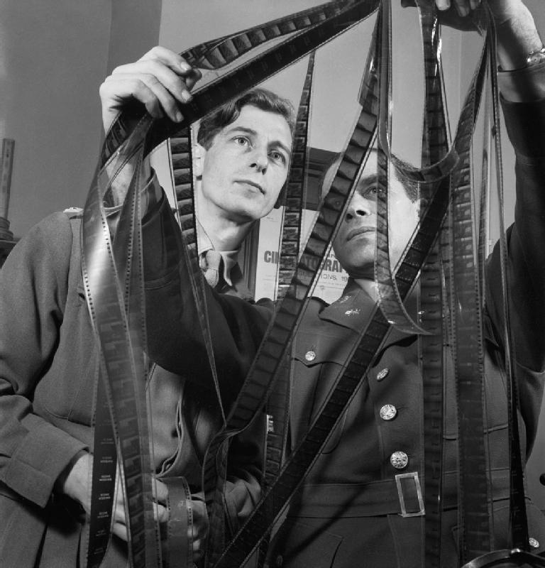
In 1918, when the video camera was created, if you filmed something and wanted to edit it, you took your footage, cut it and arranged it according to how you wanted it to look. Today, if you want to edit a video, you have to import the source assets into a specialty program (such as Adobe Premiere), and then manually view each item to watch/listen for the portion that you want. Once you have the sections of each imported asset, you have to manually arrange each item on a timeline. Of course a ton has changed, but the general workflow feels the same.

Should Critics and Festivals Give Editing Awards? Yes, and Here's Why |  IndieWire
Real life photo of me navigating my Premiere assets folders

How did video production and editing not get its digital-first methods of creation? Computing power has skyrocketed. Access to storage is generally infinite. And our computers are networked around the world. How is it that the workflow of import, edit, and export take so long?

The consumerization of video editing has simplified certain elements by abstracting away seemingly important but complicated components, such as the linearity of time. Things like Tiktok seem to be the most dramatic shift in video creation, in that the workflow shifts from immediate review and reshooting of video. Over the years, the iMovies and such have moved timelines, from horizontal representation of elapsed time into general blocks of “scenes” or clips. The simplification through abstraction is important for the general consumer, but reduces the attention to detail. This creates an aesthetic of its own, which seems to be the result of the changing of tools.

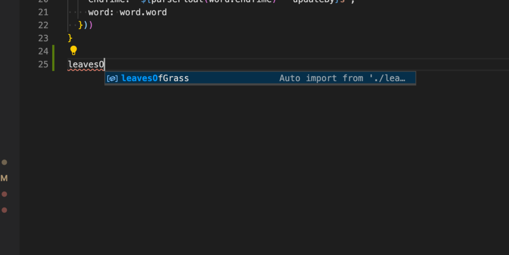
Where are all the things I take for granted in developer tools, like autocomplete or class-method search, in the video equivalent? What is autocomplete look like in editing a video clip? Where are the repeatable “patterns” I can write once, and reuse everywhere? Why does each item on a video canvas seem to live in isolation from one another, with no awareness of other elements or an ability to interact with each other?

My code editor searches my files and tried to “import” the methods when I start typing.

As someone who studied film and animation exclusively for multiple years, I’m generally surprised that the overall ways of producing content are largely the same as they have been 10 years ago, but also seemingly for the past 100.

I understand that the areas of complexity have become more niche, such as in VFX or multi-media. I have no direct experience with any complicated 3D rendering and I haven’t tried any visual editing for non-traditional video displays, so its a stretch to say film hasn’t changed at all. I haven’t touched the surface in new video innovation, but all considering, I wish some basic things were much easier.

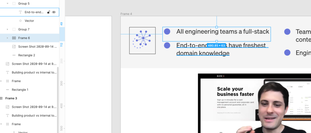
For one, when it comes to visual layout, I would love something like the Figma “autolayout” functionality. If I have multiple items in a canvas, I’d like them to self-arrange based on some kind of box model. There should be a way to assign the equivalent of styles as “classes”, such as with CSS, and multiple text elements should be able to inherit/share padding/margin definitions. Things like flexbox and relative/absolute positioning would make visual templates significantly much easier and faster for developing fresh video content.

Currently I make visual frames in Figma, then export them because its so much easier than fumbling through the 2D translations in Premiere

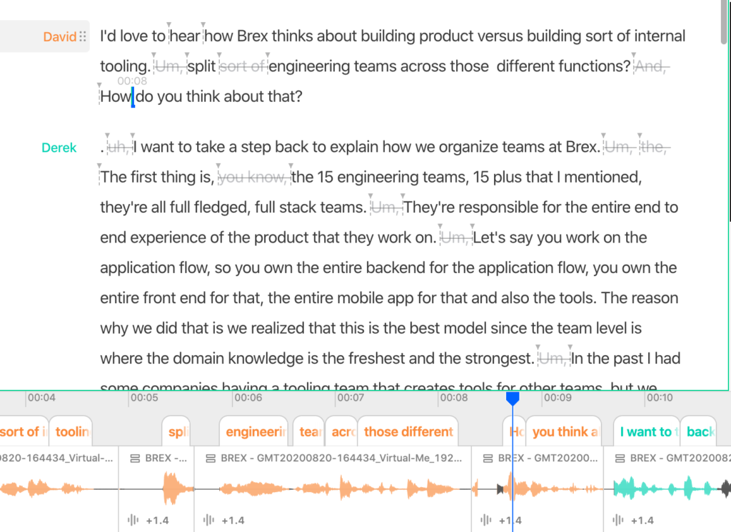
I would love to have a “smarter” timeline that can surface “cues” that I may want to hook into for visual changes. The cues could make use of machine analyzable features in the audio and video, based on features detected in the available content. This is filled with lots of hairy areas, and definitely sounds nicer than it might be in actuality. At a basic example, the timeline could look at audio or a transcript and know when a certain speaker is talking. There are already services, such as Descript, that make seamless use of speaker detection. That should find some expression in video editing software. Even if the software itself doesn’t detect this information, the metadata from other software should be made use of.

The two basic views in Zoom. Grid or speaker.

More advanced would be to know when certain exchanges between multiple people are a self-encompassed “point”. Identifying when a “exchange” takes place, or when a “question” is “answered”, would be useful for title slides or lower-thirds with complimentary text.

Descript will identify speakers and color code the transcript.

If there are multiple shots of the same take, it would be nice to have the clips note where the beginning and end based on lining up the audio. Reviewing content shouldn’t be done in a linear fashion if there are ways to distinguish content of video/audio clip and compare it to itself or other clips.

In line with “cues”, I would like to “search” my video in a much more comprehensive way. My iPhone photos app lets me search by faces or location. How about that in my video editor? All the video clips with a certain face or background?

Also, it would be nice to generate these “features” with some ease. I personally dont know what it would take to train a feature detector by viewing some parts of a clip, labeling it, and then using the labeled example to find the other instances of similar kinds of visual content. I do know its possible, and that would be very useful for speeding up the editing process.

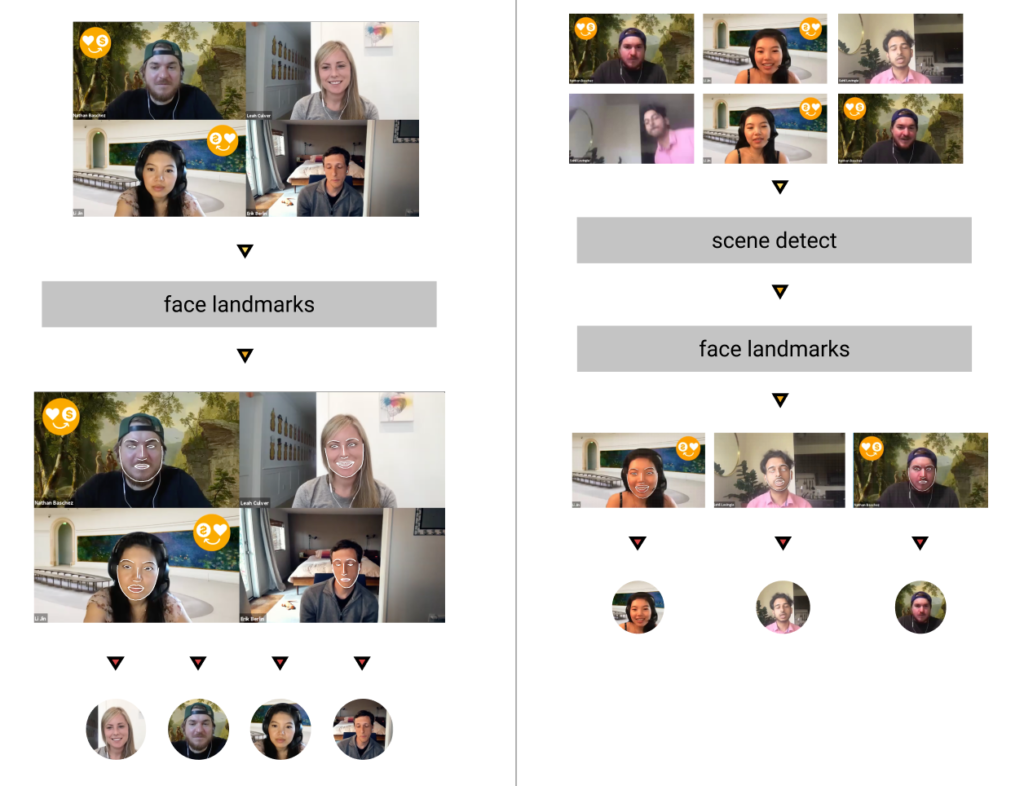
In my use case, I’m seeing a lot of video recordings of Zoom calls or webinars. This is another example of video content that generally looks the “same” and could be analyzed for certain content types. I would be able to quickly navigate through clips if I could be able to filter video by when the video is a screen of many faces viewed at once, or when only one speaker is featured at a time.

All of this to say, there is a lot of gaps in the tools available at the moment.

Filed Under: video Tagged With: film, post production, Programming, video editing

Making the variable fonts Figma plugin (part 1 – what is variable fonts [simple])

September 8, 2020 by rememberlenny

See this video summary at the bottom of the post, or by clicking this picture.
Important update: The statement that Google Fonts only displays a single variable font axis was wrong. Google Fonts now has a variable font axis registry, which displays the number of non-weight axes that are available on their variable fonts. View the list here: https://fonts.google.com/variablefonts

Variable fonts are a new technology that allows a single font file to render a range designs. A traditional font file normally corresponds to a single weight or font style (such as italics or small caps). If a user users a bold and regular font weight, that requires two separate font files, which respectively correspond to each font weight. Variable fonts allow for a single font file to take a parameter and render various font weights. One font file can then render thin, regular, and bold based on font variation settings used to invoke the font. Even more, the variable font files can also render everything between those various “static instances”, allowing for intrigue expressibility.

At a high level, variable fonts aren’t broadly “better” than static fonts, but allow for tradeoffs that can potentially benefit an end user. For example, based on the font’s underlying glyph designs, a single variable font file can actually be smaller in byte size than multiple static font files, while offering the same visual expressibility. While the size does depend on the font glyph’s “masters”, another beneficial factor is that a single variable font requires less network requests to accomplish a wide design space.

Example how Figma canvas is rendering “Recursive” variable font with various axis values.

Outside of technical benefits, variable fonts provide an incredible potential for design flexibility which isn’t possible with static instances alone. The example of a variable font and font weight was given above, but actually a variable font can have any number of font axes based on the designers wishes. Another common font axis is the “slant” axis, which allows a glyph to go between being italics and upright. Rather than being a boolean switch, in many cases, the available design space is a range which provides for potential around intentional font animation/transitions as well.

Key terminology:

Design space: the range of visual ways which a font file can be rendered, based on the font designers explicit intention. Conceptually, this can be visualized as a multidimensional space, and the glyph’s visual composition is a single point in the space.

Variable axis: A single parameter which can be declared to determine a fonts design space. For example, the weight axis.

Variable font settings: The compilation of variable axis definitions, which are passed to a variable font and determine the selected design space. 

Static instances: An assigned set of font axis settings, often stored with a name that can be accessed from the font. For example, “regular 400” or “black 900”.

Importantly, variable fonts are active and available across all major browsers. Simply load them in as a normal font, and pass the variable-font-settings css property to explicitly declare the passed variable axis parameters.

Google Font’s variable fonts filter.

As you can see here, a normal font weight declaration or a font style declaration would look like this, but a variable font style definition allows for a wider range of expression.

Google Fonts is currently a major web font service that makes using variable fonts extremely easy. Their font directory allows for filtering on variable fonts, and the font specimens pages allow you to sample the font’s static instances as well as the font weight variable axis. While Google Fonts serves variable fonts, they are currently limiting their API to single font weight axes.

Inter font’s weight and slant axis

One popular font, beloved by developers and designers alike is Inter, which was designed by Rasmus Andersson. Inter contains a weight access, as you can see from the Google Fonts specimen page. If you go directly to the Inter specimen website, you can actually see that it also contains a second font axis – the slant axis, which was mentioned above. 

From the specimen page, you can also see that assigning the weight and slant can allow for use cases that make it invoke different feelings of seriousness, casualness, and legibility. While changing the font weight can make it easier to read, based on the size of the font, it can also be combined with colors (for example in dark mode) to stand out more in the page’s visual hierarchy.

Another font to show as an example is Stephen Nixon’s Recursive. Recursive can also be found on Google Fonts, but again by going to the font’s own specimen page, you can experiment with its full design space. Recursive contains three font axes that are unique: expression, cursive and mono. Additionally, as you can see, certain glyphs in the font will change based on the combined assigned font axis values. One example is the lowercase “a”, as well as the lowercase “g”.

Example of the “a” and “g” on the Recursive font’s glyph changes

For Recursive, some of the font axes are boolean switches, as opposed to ranges. The font is either mono or not. Also the range values can be explicitly limited, such as with the cursive axis which is either on/off/auto.

Side note – with Inter, one thing to note that was glanced over is how changes in the font’s weight axis actually result in changing the width of the font glyph. For Recursive, which has a “mono” axis, the weight is explicitly not meant to adjust the width of a font glyph. While not found in either of these two fonts, a very useful font axis which is sometimes found is the “grade” axis, which allows for glyphs to become thicker, without expanding in width.

All of this is a quick overview, but if you are interested in learning more, do check out TypeNetwork’s variable font resource to see some interactive documentation.

Beyond the browser, major Adobe software products as well as Sketch now renders basic font axis sliders to customize variable fonts. As I switch between code and design software, I was surprised to find that Figma was one of the few design softwares that wasn’t compatible with variable fonts and their variable font settings. That being said, they do have an incredible plugin API which allows someone to potentially hack together a temporary solution until they have time to implement them fully.

In the next blog post, I’ll go into how Figma’s plugin architecture lets you render variable fonts as SVG vector glyphs.

Filed Under: frontend, programming Tagged With: figma, typography, variable fonts

React Figma Plugin – How to get data from the canvas to your app

September 2, 2020 by rememberlenny

I had much too hard of a time groking the Figma Plugin’s documentation, and thought I would leave a note for any brave souls to follow.

Figma has a great API and documentation around how to make a plugin on the desktop app. When writing a plugin, you have access to the entire Figma canvas of the active file, to which you can read/write content. You also have quite a lenient window API from which you can make external requests and do things such as download assets or OAuth into services.

All of this being said, you are best off learning about what you can do directly from Figma here.

If you are like me, and working on a plugin, which you have decided to write in React, then you may encounter the desire to receive callback events from the Figma canvas in your app. In my case, I wanted the React application to react to the updated user selection, such that I could access the content of a TextNode, and update the plugin content accordingly.

To do this, I struggled with the Figma Plugin examples to understand how to access data from the canvas and into my app. The Figma Plugin examples, which can be found here, have a React application sample which sends data to the canvas, but not the other way around. While this is seemingly straight forward, I didn’t immediately absorb the explanations from Figma Plugin website.

In retrospect, the way to do this is quite simple.

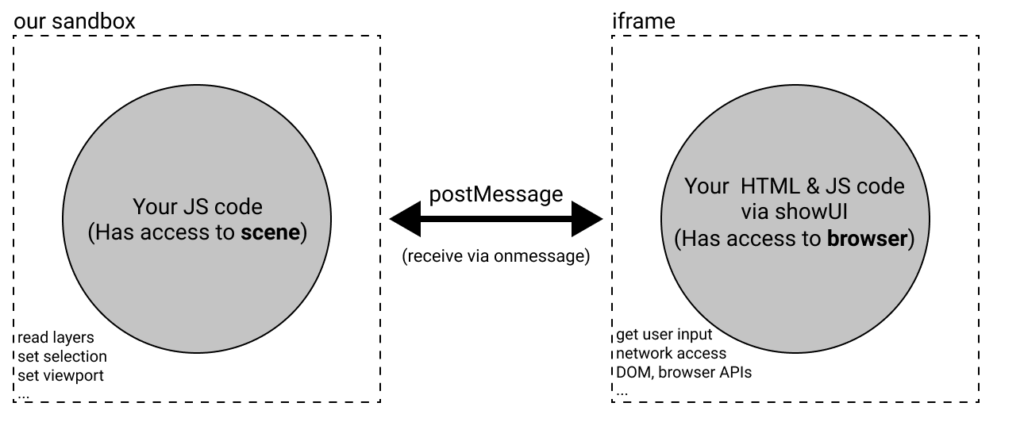
First, the Figma Plugin API uses the Window postMessage API to transmit information. This is explained in the Plugin documentation with a clear diagram which you can see here:

The first thing to note from this diagram is the postMessage API, which I mentioned above. The second thing is that the postMessage API is bi-directional, and allows for data to go from the app to the canvas, and vice-versa.

Practically speaking, the React Figma Plugin demo shows this in the example

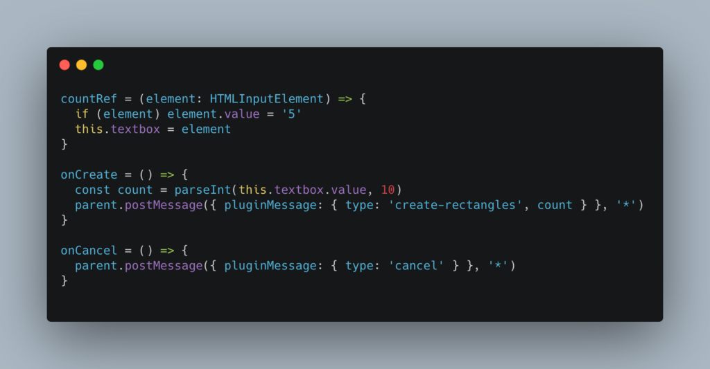
This is part of the React app, which is in the ui.tsx file

In the example, the postMessage API is using the window.parent object to announce from the React app to the Figma canvas. Specifically, from the plugin example, there are two JavaScript files – code.ts and ui.tsx, which respectively handle the code that directly manages the figma plugin API, and the UI code for the plugin itself.

While the parent object is used to send data to the canvas, you need to do something different to receive data. You can learn about how the window.parent API exists here. In short, iFrames can speak to the parent windows. As the Figma Plugin ecosystem runs in a iFrame, this is how the postMessages are exchanged.

To receive data from the figma api, you need to setup a postMessage from the code.ts file, which has access to the figma object.

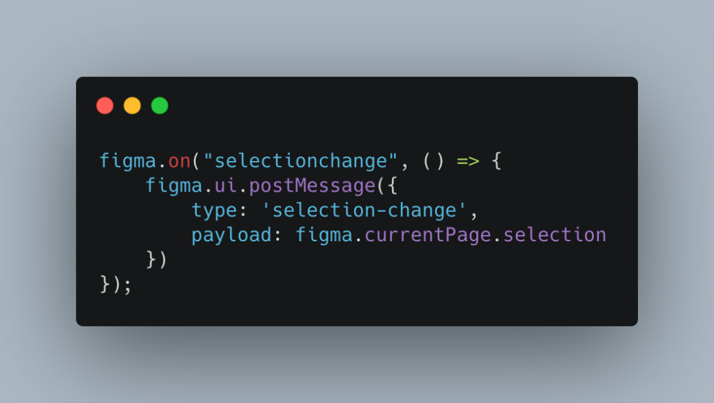
In my case, the example is that I would like to access the latest selected items from the figma canvas, when the user has selected something new. To do that, I have the following code which creates an event listener on the figma object, and then broadcasts a postMessage containing that information.

This is happening from the code.ts file

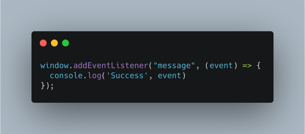
Once the figma object broadcasts the message, the React app can then receive the message. To receive this from the React application, you can create a simple EventListener on message.

Now the part that was unintuitive, given the example, was that the React app listens directly to the window object to receive the data broadcasted from the code.ts file. You can see an example below.

Event listener which can live anywhere in your React app (ie. ui.tsx)

As you can see, to listen for the event in the React application, the window.addEventListener is used, as opposed to parent.addEventListener. This is done because the React application is unable to setup event listeners on the parent, due to cross-origin rules. To bypass this, you can access the window object, and the postMessage API properly passes the data that was broadcasted from the code.ts file.

To summarize, to get data from the React application to the Figma plugin, you use parent.postMessage in your React code, which is demo-ed as the ui.tsx file. To get data from the Figma canvas into the React application, you need to broadcast a postMessage message using the figma.ui.postMessage method (demo-ed from code.ts), which then can be listened to from the React application using the window.addEventListener.

I hope this helps if you are looking to send data from the Figma Plugin to your React application!

Filed Under: programming Tagged With: figma

  • Go to page 1
  • Go to page 2
  • Go to page 3
  • Interim pages omitted …
  • Go to page 86
  • Go to Next Page »

Primary Sidebar

Recent Posts

  • How to succeed at being a graffiti artist
  • Second order effects of companies as content creators
  • Text rendering stuff most people might not know
  • Why is video editing so horrible today?
  • Making the variable fonts Figma plugin (part 1 – what is variable fonts [simple])

Archives

  • February 2021
  • October 2020
  • September 2020
  • August 2020
  • December 2019
  • March 2019
  • February 2019
  • November 2018
  • October 2018
  • April 2018
  • January 2018
  • December 2017
  • October 2017
  • July 2017
  • February 2017
  • January 2017
  • November 2016
  • October 2016
  • August 2016
  • May 2016
  • March 2016
  • November 2015
  • October 2015
  • September 2015
  • July 2015
  • June 2015
  • May 2015
  • March 2015
  • February 2015
  • January 2015
  • December 2014
  • November 2014
  • October 2014
  • September 2014
  • August 2014
  • July 2014
  • June 2014
  • May 2014
  • April 2014
  • March 2014
  • February 2014
  • January 2014
  • December 2013
  • October 2013
  • June 2013
  • May 2013
  • April 2013
  • March 2013
  • February 2013
  • January 2013
  • December 2012

Tags

  • 10 year reflection (1)
  • 100 posts (2)
  • 2013 (1)
  • academia (2)
  • Advertising (3)
  • aging (1)
  • Agriculture (1)
  • analytics (3)
  • anarchy (1)
  • anonymous (1)
  • api (1)
  • arizona (1)
  • Art (2)
  • art history (1)
  • artfound (1)
  • Artificial Intelligence (2)
  • balance (1)
  • banksy (1)
  • beacon (1)
  • Beacons (1)
  • beast mode crew (2)
  • becausewilliamshatner (1)
  • Big Data (1)
  • Birthday (1)
  • browsers (1)
  • buddhism (1)
  • bundling and unbundling (1)
  • china (1)
  • coding (1)
  • coffeeshoptalk (1)
  • colonialism (1)
  • Communication (1)
  • community development (1)
  • Computer Science (1)
  • Computer Vision (6)
  • crowdsourcing (1)
  • cyber security (1)
  • data migration (1)
  • Deep Learning (1)
  • design (1)
  • designreflection (1)
  • Developer (1)
  • Digital Humanities (2)
  • disruption theory (1)
  • Distributed Teams (1)
  • drawingwhiletalking (16)
  • education (3)
  • Email Marketing (3)
  • email newsletter (1)
  • Employee Engagement (1)
  • employment (2)
  • Engineering (1)
  • Enterprise Technology (1)
  • essay (1)
  • Ethics (1)
  • experiement (1)
  • fidgetio (38)
  • figma (2)
  • film (1)
  • film industry (1)
  • fingerpainting (8)
  • first 1000 users (1)
  • fonts (1)
  • forms of communication (1)
  • frontend framework (1)
  • fundraising (1)
  • Future Of Journalism (3)
  • future of media (1)
  • Future Of Technology (2)
  • Future Technology (1)
  • game development (2)
  • Geospatial (1)
  • ghostio (1)
  • github (2)
  • global collaboration (1)
  • god damn (1)
  • google analytics (1)
  • google docs (1)
  • Graffiti (23)
  • graffitifound (1)
  • graffpass (1)
  • growth hacking (1)
  • h1b visa (1)
  • hackathon (1)
  • hacking (1)
  • hacking reddit (2)
  • Hardware (1)
  • hiroshima (1)
  • homework (1)
  • human api (1)
  • I hate the term growth hacking (1)
  • ie6 (1)
  • ifttt (4)
  • Image Recognition (1)
  • immigration (1)
  • instagram (1)
  • Instagram Marketing (1)
  • internet media (1)
  • internet of things (1)
  • intimacy (1)
  • IoT (1)
  • iteration (1)
  • jason shen (1)
  • jobs (2)
  • jrart (1)
  • kickstart (1)
  • king robbo (1)
  • labor market (1)
  • Leonard Bogdonoff (1)
  • Literacy (1)
  • location (1)
  • Longform (2)
  • looking back (1)
  • los angeles (1)
  • Machine Learning (13)
  • MadeWithPaper (106)
  • making games (1)
  • management (1)
  • maps (2)
  • marketing (4)
  • Marketing Strategies (1)
  • Media (3)
  • medium (1)
  • mentor (1)
  • message (1)
  • mindmeld games (1)
  • Mobile (1)
  • Music (2)
  • Music Discovery (1)
  • neuroscience (2)
  • new yorker (1)
  • Newspapers (3)
  • nomad (1)
  • notfootball (2)
  • npaf (1)
  • odesk (1)
  • orbital (14)
  • orbital 2014 (14)
  • orbital class 1 (9)
  • orbitalnyc (1)
  • paf (2)
  • paid retweets (1)
  • painting (2)
  • physical web (1)
  • pitching (2)
  • popular (1)
  • post production (1)
  • Privacy (1)
  • process (1)
  • product (1)
  • Product Development (2)
  • product market fit (2)
  • Programming (6)
  • project reflection (1)
  • promotion (1)
  • prototype (17)
  • prototyping (1)
  • Public Art (1)
  • Public Speaking (1)
  • PublicArtFound (15)
  • Publishing (3)
  • Python (1)
  • quora (1)
  • Rails (1)
  • React (1)
  • React Native (1)
  • real design (1)
  • recent projects (1)
  • reddit (3)
  • redesign (1)
  • reflection (2)
  • rememberlenny (1)
  • Remote work (1)
  • replatform (1)
  • Responsive Emails (1)
  • retweet (1)
  • revenue model (1)
  • rick webb (1)
  • robert putnam (1)
  • ror (1)
  • rubyonrails (1)
  • segmenting audience (1)
  • Semanticweb (2)
  • Senior meets junior (1)
  • SGI (1)
  • Side Project (1)
  • sketching (22)
  • social capital (1)
  • social media followers (2)
  • social media manipulation (1)
  • social media marketing (1)
  • social reach (5)
  • software (3)
  • Soka Education (1)
  • Spatial Analysis (2)
  • spotify (1)
  • stanford (2)
  • Startup (21)
  • startups (7)
  • stree (1)
  • Street Art (5)
  • streetart (5)
  • stylometrics (1)
  • Technology (1)
  • thoughts (1)
  • Time as an asset in mobile development (1)
  • Towards Data Science (4)
  • TrainIdeation (42)
  • travel (1)
  • traveling (1)
  • tumblr milestone (2)
  • twitter (1)
  • twitter account (2)
  • typography (2)
  • unreal engine (1)
  • user behavior (1)
  • user experience (3)
  • user research (1)
  • user testing (1)
  • variable fonts (1)
  • video editing (2)
  • visual effects (1)
  • warishell (1)
  • Web Development (8)
  • webdec (1)
  • webdev (13)
  • windowed launch (1)
  • wordpress (1)
  • Work Culture (1)
  • workinprogress (1)
  • zoom (1)