• Skip to primary navigation
  • Skip to main content
  • Skip to primary sidebar

Remember Lenny

Writing online

  • Portfolio
  • Email
  • Twitter
  • LinkedIn
  • Github

How to write Desktop-first responsive emails

March 6, 2016 by rememberlenny

Reading Time: 3 minutes read

Most web pages are written with the assumption that all the content is loaded, then the CSS determines the priority for styling. In emails, you have to design your CSS/class/markup base on the assumption that you can have some parts of your code NOT run.

When it comes to responsive layouts, you have to design for the case where desktop is default (without the media queries) and any media queries are added, only if its possible to run inline styles. In the case where you have things like Gmail, where the style tags are stripped out, you need to account for this.
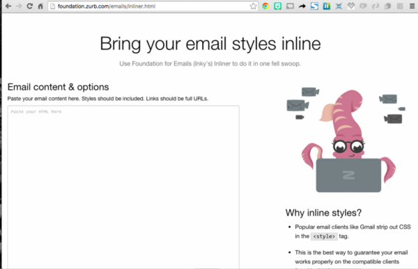
Inliner from Zurb Foundation — http://foundation.zurb.com/emails/inliner.html

Inliners

Most email browsers don’t read style tags. As a result, you have to write your emails with all the CSS properties as style tags in the html tag. This is called inlined CSS. Instead of writing the raw HTML with inlined CSS, there are many services or libraries for inlining a block of HTML and CSS.

The problem with email inliners, like Rail’s Roadie, was that it was inlining the media query styles that would run on mobile, which broke the default desktop layout. By having roadie ignore certain styles, we control the designed layout to render the desktop mode in all cases, and then serve the inline style tag with media queries to be run where possible.

To make things more complicated, Outlook is very outdated. Specifically, there are a lot of CSS3 properties and even CSS2 properties it doesn’t render. As a result, outlook has some legacy hacks where you can use comment flags to tell Outlook NOT to render certain content.

Basics

For responsive emails, where you use media queries, you have to keep a few things in mind.

1. The email is being inlined
2. Email browsers render CSS2 on average
3. You have some email browsers that have comment hacks (ie. outlook)

Where to start

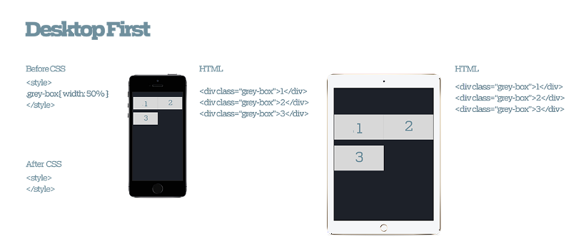
Write Desktop-First HTML and CSS

Based on this factor, you have to code your emails to be desktop-first. The CSS, without any media queries, need to look good on desktop email browsers. This way, you can assume at the very least, the email looks like this:


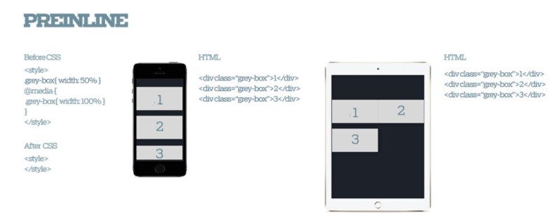
Add Media Query for mobile CSS

Considering you want to add a media query, you need to add an inline media query on the email. This is pretty straight forward for desktop rendering. For example, you would get something like this:


Setup your inliner

The problem comes up in emails, the two conditions above don’t work perfectly. For CSS to render in emails, it needs to be inlined. This means that the desktop or media query conditions don’t jive well together. This why we started with the Desktop-First css structure. One you inline your css, when theres a media query, you get this mess:


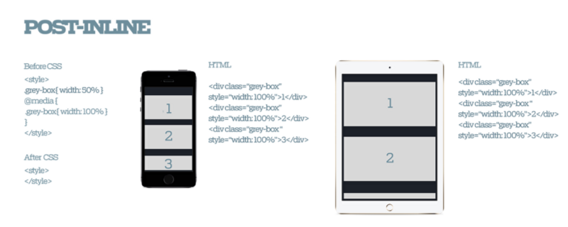
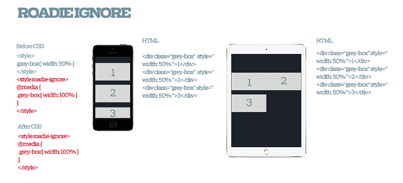
Consider your inliner to ignore media query for inline

When you have a media query, the media queries CSS gets inlined, and consequently overrides the desktop CSS. As a result, you get markup that looks broken. To prevent this, you have to queue your CSS inliner to ignore the media query CSS. To do this, you separate the media query CSS in a seperate style tag and you flag it in the inliner. In the case for Roadie, thats the `roadie-ignore` flag. This way you get this:


Wrap up

By setting the inliner to ignore the media query style tag, you allow all email browsers to render the working desktop CSS. In the case that the email browser will parse the style tag, it can view the media query and optionally render the mobile styles when relevant. This is how you can have cross-email-browser functional CSS emails!


This was written as a comment in a pull request for C2, a project at 18F. We are using this responsive email structure to make our transactional emails better for our end users. We are also doing some awesome stuff. Reach out if you want to learn more.

Filed Under: Uncategorized Tagged With: Email Marketing, Responsive Emails, Web Development

Primary Sidebar

Recent Posts

  • Thoughts on my 33rd birthday
  • Second order effects of companies as content creators
  • Text rendering stuff most people might not know
  • Why is video editing so horrible today?
  • Making the variable fonts Figma plugin (part 1 – what is variable fonts [simple])

Archives

  • August 2022
  • February 2021
  • October 2020
  • September 2020
  • August 2020
  • December 2019
  • March 2019
  • February 2019
  • November 2018
  • October 2018
  • April 2018
  • January 2018
  • December 2017
  • October 2017
  • July 2017
  • February 2017
  • January 2017
  • November 2016
  • October 2016
  • August 2016
  • May 2016
  • March 2016
  • November 2015
  • October 2015
  • September 2015
  • July 2015
  • June 2015
  • May 2015
  • March 2015
  • February 2015
  • January 2015
  • December 2014
  • November 2014
  • October 2014
  • September 2014
  • August 2014
  • July 2014
  • June 2014
  • May 2014
  • April 2014
  • March 2014
  • February 2014
  • January 2014
  • December 2013
  • October 2013
  • June 2013
  • May 2013
  • April 2013
  • March 2013
  • February 2013
  • January 2013
  • December 2012

Tags

  • 10 year reflection (1)
  • 100 posts (2)
  • 2013 (1)
  • academia (2)
  • Advertising (3)
  • aging (1)
  • Agriculture (1)
  • analytics (3)
  • anarchy (1)
  • anonymous (1)
  • api (1)
  • arizona (1)
  • Art (2)
  • art history (1)
  • artfound (1)
  • Artificial Intelligence (2)
  • balance (1)
  • banksy (1)
  • beacon (1)
  • Beacons (1)
  • beast mode crew (2)
  • becausewilliamshatner (1)
  • Big Data (1)
  • Birthday (1)
  • browsers (1)
  • buddhism (1)
  • bundling and unbundling (1)
  • china (1)
  • coding (1)
  • coffeeshoptalk (1)
  • colonialism (1)
  • Communication (1)
  • community development (1)
  • Computer Science (1)
  • Computer Vision (6)
  • crowdsourcing (1)
  • cyber security (1)
  • data migration (1)
  • Deep Learning (1)
  • design (1)
  • designreflection (1)
  • Developer (1)
  • Digital Humanities (2)
  • disruption theory (1)
  • Distributed Teams (1)
  • drawingwhiletalking (16)
  • education (3)
  • Email Marketing (3)
  • email newsletter (1)
  • Employee Engagement (1)
  • employment (2)
  • Engineering (1)
  • Enterprise Technology (1)
  • essay (1)
  • Ethics (1)
  • experiement (1)
  • fidgetio (38)
  • figma (2)
  • film (1)
  • film industry (1)
  • fingerpainting (8)
  • first 1000 users (1)
  • fonts (1)
  • forms of communication (1)
  • frontend framework (1)
  • fundraising (1)
  • Future Of Journalism (3)
  • future of media (1)
  • Future Of Technology (2)
  • Future Technology (1)
  • game development (2)
  • Geospatial (1)
  • ghostio (1)
  • github (2)
  • global collaboration (1)
  • god damn (1)
  • google analytics (1)
  • google docs (1)
  • Graffiti (23)
  • graffitifound (1)
  • graffpass (1)
  • growth hacking (1)
  • h1b visa (1)
  • hackathon (1)
  • hacking (1)
  • hacking reddit (2)
  • Hardware (1)
  • hiroshima (1)
  • homework (1)
  • human api (1)
  • I hate the term growth hacking (1)
  • ie6 (1)
  • ifttt (4)
  • Image Recognition (1)
  • immigration (1)
  • instagram (1)
  • Instagram Marketing (1)
  • internet media (1)
  • internet of things (1)
  • intimacy (1)
  • IoT (1)
  • iteration (1)
  • jason shen (1)
  • jobs (2)
  • jrart (1)
  • kickstart (1)
  • king robbo (1)
  • labor market (1)
  • Leonard Bogdonoff (1)
  • Literacy (1)
  • location (1)
  • Longform (2)
  • looking back (1)
  • los angeles (1)
  • Machine Learning (13)
  • MadeWithPaper (106)
  • making games (1)
  • management (1)
  • maps (2)
  • marketing (4)
  • Marketing Strategies (1)
  • Media (3)
  • medium (1)
  • mentor (1)
  • message (1)
  • mindmeld games (1)
  • Mobile (1)
  • Music (2)
  • Music Discovery (1)
  • neuroscience (2)
  • new yorker (1)
  • Newspapers (3)
  • nomad (1)
  • notfootball (2)
  • npaf (1)
  • odesk (1)
  • orbital (14)
  • orbital 2014 (14)
  • orbital class 1 (9)
  • orbitalnyc (1)
  • paf (2)
  • paid retweets (1)
  • painting (1)
  • physical web (1)
  • pitching (2)
  • popular (1)
  • post production (1)
  • Privacy (1)
  • process (1)
  • product (1)
  • Product Development (2)
  • product market fit (2)
  • Programming (6)
  • project reflection (1)
  • promotion (1)
  • prototype (17)
  • prototyping (1)
  • Public Art (1)
  • Public Speaking (1)
  • PublicArtFound (15)
  • Publishing (3)
  • Python (1)
  • quora (1)
  • Rails (1)
  • React (1)
  • React Native (1)
  • real design (1)
  • recent projects (1)
  • reddit (3)
  • redesign (1)
  • reflection (2)
  • rememberlenny (1)
  • Remote work (1)
  • replatform (1)
  • Responsive Emails (1)
  • retweet (1)
  • revenue model (1)
  • rick webb (1)
  • robert putnam (1)
  • ror (1)
  • rubyonrails (1)
  • segmenting audience (1)
  • Semanticweb (2)
  • Senior meets junior (1)
  • SGI (1)
  • Side Project (1)
  • sketching (22)
  • social capital (1)
  • social media followers (2)
  • social media manipulation (1)
  • social media marketing (1)
  • social reach (5)
  • software (3)
  • Soka Education (1)
  • Spatial Analysis (2)
  • spotify (1)
  • stanford (2)
  • Startup (21)
  • startups (7)
  • stree (1)
  • Street Art (4)
  • streetart (5)
  • stylometrics (1)
  • Technology (1)
  • thoughts (1)
  • Time as an asset in mobile development (1)
  • Towards Data Science (4)
  • TrainIdeation (42)
  • travel (1)
  • traveling (1)
  • tumblr milestone (2)
  • twitter (1)
  • twitter account (2)
  • typography (2)
  • unreal engine (1)
  • user behavior (1)
  • user experience (3)
  • user research (1)
  • user testing (1)
  • variable fonts (1)
  • video editing (2)
  • visual effects (1)
  • warishell (1)
  • Web Development (8)
  • webdec (1)
  • webdev (13)
  • windowed launch (1)
  • wordpress (1)
  • Work Culture (1)
  • workinprogress (1)
  • zoom (1)